Modern Stamp Design Techniques
The artistry of postage stamp design has certainly gone through many evolutionary changes over the last two centuries. What began with mere text and numerals became portraits and reproductions of famous paintings and photographs. Today we see a wide range of bold artwork and design elements such as holographic imagery and embossed lettering.
Of course, the available production equipment determines what can be achieved in final designs. What used to require manual printing presses now utilizes more automated machinery. Today, with the aid of computerized equipment, more minute details can be reproduced on the tiny canvas that is the final postage stamp.
some artists achieve results the old fashioned way
With all the advances in design and production equipment, one would think that all modern postage stamp design techniques involve specialized graphic design software. However, some amazing artists choose to produce their artwork the old fashioned way–with some modern twists. And the results are truly awesome. Stuart McLachlan is one such artist.
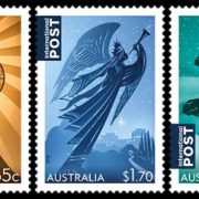
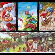
Mr. McLachlan has mastered and made famous the art technique known as “paper-cut”. His artwork featured in Australia’s 2016 Christmas Stamp series shows the elegance of paper-cut artwork. I do a little computer graphic work here and there. So, at first glance, I thought the designs shown above were computer generated. Yet somehow they seemed more lifelike…had more depth.
his effect is much more realistic
As I read the article on the Australia Post Web site about Stuart McLachlan’s paper-cut Christmas Stamps, I was truly amazed at how these designs were created. See, most computer graphic designs that attempt to display depth involve shadowing behind an object. Likewise an embossed “feel” is often created with mathematically generated shadowing around areas intended to appear raised or textured. McLachlan’s work clearly doesn’t have this; yet his effect is much more realistic. (See the Australia Post site link above for larger images which show the texture in more detail)
the results speak for themselves
So how does Stuart pull this off? Well, it’s not with computer software. Instead, McLachlan’s paper-cut designs are achieved with wire, water color paper, an Xacto knife, a camera, some lighting, and many hours of effort. The only parts of the process that involve software are final coloring and conversion to digital artwork for reproduction. If I had to paraphrase the technique as I now understand it, I’d say that the procedure is like photographing a diorama containing only silhouette figures and objects. He cuts the silhouette figures by hand. The entire process is manual, by-hand, work. And the results speak for themselves.
Why does it look so real? Because it is! Each figure and object is cut by hand, hung by wire in proportional distance from the rest, and photographed as a group scene. Clearly, smarter use of old-fashioned tools mixed with a passion for beauty can result in truly amazing artwork.


